




Introduction
Data Displays Extended is an important Grade 6 math skill because students are moving from simple answers toward explaining how the math works.
In this lesson, students use models, real questions, worked examples, practice problems, and two online quizzes to build confidence with data displays extended.
What Is Data Displays Extended?
Data Displays Extended means reading, creating, and explaining displays so data can answer real questions.
The goal is not only to get the answer. Students should be able to show the idea, explain the strategy, and check whether the answer makes sense.
Understanding Data Displays Extended
Before solving, students should slow down and decide what each number, shape, unit, or label represents.
- Read the title, labels, and scale before answering.
- Use the scale value instead of counting marks as ones when the graph is scaled.
- Compare categories by subtracting or adding values from the display.
- Explain what the data shows in a complete sentence.
Visual Models
Visual Model 1
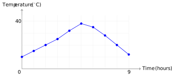
Question: This line graph shows how outdoor temperature changed from 6 AM to 3 PM. Which statement is TRUE?
- A. Temperature peaked around noon (5 hours after start)
- B. Temperature decreased continuously all day
- C. Temperature was highest at 6 AM
- D. Temperature was constant throughout the day
Why it works: The graph shows the line reaching its highest point at the 5-hour mark, which corresponds to noon. The other statements contradict the visual data.
Answer: Temperature peaked around noon
Visual Model 2
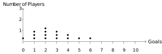
Question: A dot plot shows the number of goals scored by soccer players in one season: How many players scored 2 or 3 goals?
- A. 4
- B. 3
- C. 6
- D. 7
Why it works: The dot plot shows 4 dots above 2 goals and 3 dots above 3 goals. Adding: 4 + 3 = 7 players.
Answer: 7 players
Worked Examples
Example 1
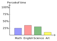
Question: The bar graph shows how a student spent 20 hours studying different subjects, by percent of total time. How many hours were spent on Science?
- A. 6 hours
- B. 4 hours
- C. 5 hours
- D. 8 hours
- Science takes up 30% of the bar (1.2 out of 4 units), which is 0.3 \(\times\) 20 = 6 hours.
Answer: 6 hours
Example 2
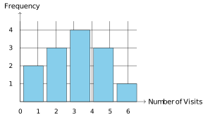
Question: This histogram shows the number of gym visits students made in a month. How many students visited the gym 2 or 3 times?
- A. 4
- B. 8
- C. 11
- D. 7
- The bars for 2 visits and 3 visits have heights of 3 and 4 respectively.
- Total: 3 + 4 = 7 students.
Answer: 7 students
Example 3
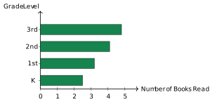
Question: This horizontal bar graph shows the average number of books read by different grade levels. How many more books did 3rd graders read on average compared to kindergarteners?
- A. 2.3 books
- B. 2.5 books
- C. 2.4 books
- D. 3.0 books
- 3rd graders read approximately 4.8 books; kindergarteners read approximately 2.5 books.
- The difference is about 4.8 − 2.5 = 2.3 books.
Answer: 2.3 books
Real-World Word Problems
Problem 1
Question: A double-bar graph compares the number of books read by boys and girls over 3 months. In January, boys read 24 books and girls read 18. In February, boys read 30 and girls read 28. In March, boys read 26 and girls read 32.
In which month did girls read more books than boys?
- A. January
- B. None
- C. February
- D. March
Why it works: In March, girls read 32 books and boys read 26 books. Since 32 > 26, girls read more in March only.
Answer: March
Problem 2
Question: A circle graph (pie chart) shows the distribution of 360 students by lunch preference: pizza 120 students, tacos 90 students, salad 60 students, other 90 students.
What angle in degrees should the pizza section span?
- A. 180 degrees
- B. 90 degrees
- C. 60 degrees
- D. 120 degrees
Why it works: Pizza accounts for \(\frac{120}{360} = \frac{1}{3}\) of students. The angle is \(\frac{1}{3} \times 360° = 120°\).
Answer: 120 degrees
Common Mistakes
- Ignoring the graph scale.
- Reading the wrong category or axis label.
- Answering a comparison question without subtracting.
- Writing a number without explaining what it represents.
Strategy Tips
- Circle the scale before using the graph.
- Write down the value for each category you compare.
- Use addition for totals and subtraction for differences.
- Answer in words so the data result has meaning.
Practice Questions
Question 1
Which data display is BEST for showing how a single numerical variable is distributed across many values?
- A. Bar graph
- B. Histogram
- C. Pictograph
- D. Circle graph
Question 2
A science class recorded the heights of 50 plants in cm: 8, 12, 15, 18, 20, 21, 22, 23, 25, 26, 28, 30, 31, 33, 35, 38, 40, 42, 44, 46, 48, 50, 52, 54, 55, 57, 59, 61, 62, 64, 65, 67, 68, 70, 72, 74, 75, 77, 78, 80, 82, 84, 85, 87, 88, 90, 92, 94, 95, 98.
Which display would be BEST for showing the spread and frequency of plant heights?
- A. Bar graph showing each height
- B. Pictograph with plant symbols
- C. Circle graph dividing by plant type
- D. Histogram with intervals of 10 cm
Question 3
Maria surveyed her class about favorite sports: soccer, basketball, baseball, and tennis. The results were: soccer 12, basketball 8, baseball 7, tennis 3.
What is the PRIMARY purpose of using a bar graph to display this data?
- A. To compare counts across different categories
- B. To show how the data changes over time
- C. To display parts of a whole
- D. To reveal the median and quartiles
Question 4
Which characteristic is MOST important when deciding to use a dot plot instead of a histogram?
- A. You need to show the median only
- B. The dataset is small and you want to see each value
- C. The dataset is large (over 100 points)
- D. The data represents categories, not numbers
Question 5
A box plot shows the distribution of test scores for a class. The median is 78, Q1 is 65, Q3 is 88, the minimum is 45, and the maximum is 95.
Which statement about the data is CORRECT?
- A. Exactly 50% of students scored between 65 and 88
- B. The range is 30 points
- C. All students scored above 78
- D. The interquartile range is 23 points
Question 6
Which graph is MOST misleading if the vertical axis does not start at zero?
- A. Bar graph
- B. Line graph
- C. Circle graph
- D. Dot plot
Full Answer Explanations Click to show all answers and explanations
Question 1
Answer: Histogram
A histogram groups continuous numerical data into intervals and shows frequency, making it ideal for displaying distribution. Bar graphs show categorical counts; pictographs use symbols; circle graphs show parts of a whole.
Question 2
Answer: Histogram with intervals
With 50 continuous numerical values, a histogram groups them into intervals (e.g., 0–10, 11–20, etc.) to show the distribution pattern. A bar graph for each individual height would be too crowded; circle and pictographs don't display numerical distributions.
Question 3
Answer: To compare categorical counts
Bar graphs excel at comparing values across categories (sports in this case). Line graphs show trends over time; circle graphs show parts of a whole; box plots display quartiles.
Question 4
Answer: Small dataset to see each value
Dot plots work best for small datasets where each individual value matters. Histograms are better for large datasets. Dot plots require numerical data, not categories.
Question 5
Answer: 50% scored between 65 and 88
Q1 to Q3 contains the middle 50% of data. The range is 95 − 45 = 50; not all scored above 78 (median); IQR = 88 − 65 = 23, which matches choice D. But A is the best description of what the box represents.
Question 6
Answer: Bar graph
Bar graphs are most affected because truncating the axis exaggerates the visual difference in heights. The rectangular areas appear disproportionately large or small. Line graphs are less affected; circle and dot plots don't use axes.
Connection to Standards
This lesson supports Grade 6 math expectations for reasoning, modeling, problem solving, and explaining answers clearly. It connects classroom skills to the kind of questions students see on state math assessments.
Summary
Data Displays Extended becomes easier when students connect the question to a model, use clear steps, and explain why the answer fits.
GOLDEN RULE
Read the scale before reading the answer.