




Introduction
Summarizing Data and Making Comparisons is an important Grade 6 math skill because students are moving from simple answers toward explaining how the math works.
In this lesson, students use models, real questions, worked examples, practice problems, and two online quizzes to build confidence with summarizing data and making comparisons.
What Is Summarizing Data and Making Comparisons?
Summarizing Data and Making Comparisons means reading, creating, and explaining displays so data can answer real questions.
The goal is not only to get the answer. Students should be able to show the idea, explain the strategy, and check whether the answer makes sense.
Understanding Summarizing Data and Making Comparisons
Before solving, students should slow down and decide what each number, shape, unit, or label represents.
- Read the title, labels, and scale before answering.
- Use the scale value instead of counting marks as ones when the graph is scaled.
- Compare categories by subtracting or adding values from the display.
- Explain what the data shows in a complete sentence.
Visual Models
Visual Model 1
Question: Two classes recorded the time (in seconds) each student spent on a warm-up. Summary statistics: Which class had more consistent times?
| Class | Mean | Median | Range | IQR |
|---|---|---|---|---|
| Class A | 45 | 42 | 30 | 12 |
| Class B | 48 | 50 | 25 | 8 |
- A. Class A
- B. Class B
- C. Both had the same variability.
- D. Cannot be determined.
Why it works: Class B has a smaller range (\(25 < 30\)) and smaller IQR (\(8 < 12\)), indicating less spread and more consistent times.
Answer: Class B
Visual Model 2
Question: Two basketball teams' season statistics: Which team had more consistent scoring?
| Team | Mean PPG | Std Dev |
|---|---|---|
| Hawks | 72 | 8 |
| Falcons | 70 | 14 |
- A. Hawks (lower standard deviation)
- B. Falcons (higher mean)
- C. Both equally consistent
- D. Cannot tell from standard deviation
Why it works: Standard deviation measures spread. Hawks' lower standard deviation (\(8 < 14\)) indicates more consistent scoring around their mean.
Answer: Hawks (lower standard deviation)
Worked Examples
Example 1
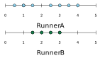
Question: Two runners' sprint times (seconds) over 8 races. Which runner has more consistent sprint times?
- A. Runner A
- B. Runner B
- C. Both are equally consistent
- D. Cannot determine from dot plots
- Runner B's times cluster tightly around 2–3 seconds (range \(\approx 1.5\)), while Runner A's times are spread from 0.5 to 4 seconds (range \(\approx 3.5\)).
- Smaller range indicates more consistency.
Answer: Runner B
Example 2
Question: Two manufacturing plants' defect rates (per 1000 units) are summarized below. Which plant's performance is more predictable?
| Plant | Mean | Median | Range |
|---|---|---|---|
| Plant X | 12 | 11 | 8 |
| Plant Y | 10 | 10 | 20 |
- A. Plant X, because it has a lower range
- B. Plant Y, because it has a lower mean
- C. Both are equally predictable
- D. Plant X, because the mean equals the median
- Predictability is measured by spread/consistency.
- Plant X (range = 8) is more consistent than Plant Y (range = 20), making its output more predictable despite a slightly higher mean.
Answer: Plant X, because it has a lower range
Example 3
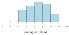
Question: A histogram shows students' reading times (minutes). The distribution is left-skewed with mean = 42 and median = 48. What does this tell us about the data?
- A. A few students read for very long periods
- B. The range is very small
- C. Most students read at the same speed
- D. A few students read for very short periods
- Left-skewed means the tail points left (low values).
- Mean (42) < median (48) indicates low-value outliers pulling the mean down.
- These outliers are students with very short reading times.
Answer: A few students read for very short periods
Real-World Word Problems
Problem 1
Question: A dot plot shows the number of books read by 10 students: \(2, 3, 3, 4, 4, 4, 5, 5, 6, 6\). What is the median number of books?
- A. \(4\)
- B. \(6\)
- C. \(5\)
- D. \(4.5\)
Why it works: With 10 data points, the median is the average of the 5th and 6th values when ordered: \((4+5) \div 2 = 4.5\).
Answer: \(4.5\)
Problem 2
Question: A histogram shows weights of 20 students. The shape is roughly symmetric. Which summary best describes the center?
- A. The mean, because symmetric data has mean \(\approx\) median.
- B. The median, because it is resistant to outliers.
- C. The mode, because it is the most common value.
- D. The range, because it spans the entire data.
Why it works: For symmetric distributions, mean and median are nearly equal and both represent the center well.
Answer: The mean, because symmetric data has mean \(\approx\) median.
Common Mistakes
- Ignoring the graph scale.
- Reading the wrong category or axis label.
- Answering a comparison question without subtracting.
- Writing a number without explaining what it represents.
Strategy Tips
- Circle the scale before using the graph.
- Write down the value for each category you compare.
- Use addition for totals and subtraction for differences.
- Answer in words so the data result has meaning.
Practice Questions
Question 1
Class A scored a mean of \(82\) on a test; Class B scored a mean of \(76\) on the same test. Which statement is best supported by the data?
- A. Every student in Class A scored higher than every student in Class B.
- B. Class A's typical score was higher than Class B's.
- C. Class B had more students than Class A.
- D. The two classes had identical performance.
Question 2
A dataset has a mean of \(50\) and a median of \(48\). Which statement is most likely true?
- A. The data is symmetric with no outliers.
- B. There are some large values pulling the mean higher than the median.
- C. There are some small values pulling the mean lower than the median.
- D. The range must be less than 10.
Question 3
A histogram shows test scores for a class. The data has a center (mean) of \(75\) and a spread (range) of \(30\). If the highest score is \(95\), what is the lowest score?
- A. \(45\)
- B. \(55\)
- C. \(65\)
- D. \(75\)
Question 4
A box plot for Dataset X shows Q1 = \(20\), median = \(25\), Q3 = \(35\). A box plot for Dataset Y shows Q1 = \(22\), median = \(26\), Q3 = \(32\). Which statement is true?
- A. Dataset X has a larger interquartile range.
- B. Dataset Y has a larger interquartile range.
- C. Both have the same interquartile range.
- D. The IQR cannot be compared.
Question 5
A dot plot shows scores: \(\{3, 5, 7, 7, 8, 8, 8, 9\}\). What is the mode?
- A. \(7\)
- B. \(3\)
- C. \(9\)
- D. \(8\)
Question 6
A dataset has 11 values arranged in order. The median is \(55\). If you remove the largest and smallest values, what will be the new median of the remaining 9 values?
- A. The median stays at \(55\).
- B. The median decreases to \(50\).
- C. The median increases to \(60\).
- D. Cannot be determined without knowing all values.
Full Answer Explanations Click to show all answers and explanations
Question 1
Answer: Class A's typical score was higher than Class B's.
The mean represents a typical score. A higher mean in Class A (\(82>76\)) supports that Class A's typical score was higher, but not that every individual outperformed.
Question 2
Answer: There are some large values pulling the mean higher than the median.
When the mean exceeds the median, high outliers are typically present, skewing the distribution right.
Question 3
Answer: \(65\)
Range = highest \(-\) lowest. \(30 = 95 - \text{lowest}\), so lowest \(= 95 - 30 = 65\).
Question 4
Answer: Dataset X has a larger interquartile range.
IQR for X \(= 35 - 20 = 15\); IQR for Y \(= 32 - 22 = 10\). Dataset X is larger.
Question 5
Answer: \(8\)
The mode is the value appearing most frequently. The value \(8\) appears 3 times, more than any other value.
Question 6
Answer: Cannot be determined without knowing all values.
The new median depends on the actual distribution. Removing extremes does not guarantee the new 5th value is still \(55\).
Connection to Standards
This lesson supports Grade 6 math expectations for reasoning, modeling, problem solving, and explaining answers clearly. It connects classroom skills to the kind of questions students see on state math assessments.
Summary
Summarizing Data and Making Comparisons becomes easier when students connect the question to a model, use clear steps, and explain why the answer fits.
GOLDEN RULE
Read the scale before reading the answer.